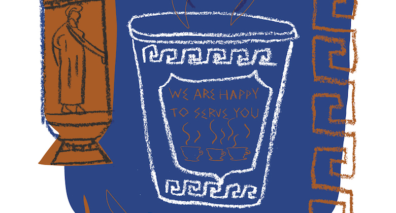
It’s “Anthora,” not “amphora” like you might remember from art history. Disposable, utilitarian and a little eccentric, the city’s Anthora cup is that blue and white Grecian-looking coffee vessel that has become a local icon. It’s not the product of a rigorous design process but still ranks alongside Milton Glaser’s “I Love New York” and Massimo Vignelli’s Subway navigation as one of the New York design and branding triumphs of the last century. That pop of blue and goldenrod that definitively places you among the coffee carts, black coats and gum-dotted concrete.

Created in 1962 by Leslie Buck, a refugee from Nazi Europe whose accent is responsible for the “th” in Anthora, the cup was targeted to be sold to the Greek owners of New York area diners. With its emotionally sticky iconography, the beloved cup became ubiquitous until the influx of to-go cups from large coffee companies pushed it out of production in 2006. A few opportunists (shocker in this town) created knock-off versions in the meantime with subtle differences in imagery and wording; instead of “WE ARE HAPPY TO SERVE YOU,” the ultramarine blue cup you thought you were holding said something like “WE ARE PLEASED TO SERVE YOU.”
The cup’s apparent staying power convinced container manufacturer Dart to reintroduce the classic in 2015, though, quenching the city’s seeming thirst for a certain nostalgia, authenticity and look. Matthew Bird, design historian and professor at the Rhode Island School of Design observes that “Emotional connection is a powerful tool in successful design. Buck might not have understood the conventions of ‘good design’ but he did understand sales and why people like things. This understanding is the real longevity behind the cup.”


